Note: In this post I am primarily talking about creative personal projects, but also some about programming and creativity in general.
Some people ask me how I create the things that I do, what inspires me, and why I do what I do. This post is to give information as to some of that.
First I’ll start with the creative process.
Step 1: Get inspired
You need to have something to create!
Most of my inspiration comes from something I see during the day, whether I recreate something I see exactly (using code) or take a spin off of it thinking, “This may be cool” or “It’d be even better if it did this”. Things that I may recreate offline are posters, objects laying around, or 3D environments. Some online sources I use for my CSS projects in particular are Tumblr, other websites, and on occasion something more artsy like a logo site or Dribble. It’s important to find more inspiration than you can make so that you have more perspective and can choose from among several what you want to do in addition to judging the usefulness of each.
Step 2: Make reasonable choices
Push your limits while keeping it simple.
When I first got into making CSS projects I naturally made simple projects – focusing on illusions and other basic things. I thought outputting content over difficulty would help get me noticed and would be more useful for me – the more the better, right?
Wrong. Creating something completely new and innovative is better practice and better for getting noticed. People don’t want to see the same types of things done, that’s boring. When deciding on a project try to do something that no one or not many people have done that is just past what you think you can do. If you end up not being able to do it you likely still have something to show, even if it’s not exactly what was planned.
With that being said we can’t ever create something wholly new, we have to have something to base it off of. Everything is a remix of sorts. And that’s great! What I mean by doing something innovative is combining things in a way that hasn’t been done before or at least not done well.
Side note: For new creators recreating something exactly is good practice so long as they don’t look how it’s done in the first place.
Lastly in reference to reasonable choices, break the project down into chunks. Something worth doing can often seem overwhelming. Working on a small portion of said project really does make it manageable.
Step 3: Start coding!
There’s good reason why “Just do it” is Nike’s slogan.
It’s quite obvious, but the only way to get something done is to start in the first place. I’ve known too many people, including myself, that have had time and ability to get a project done or learn a new skill that they wouldn’t have later, but they wasted it thinking about what they want to do and laziness.
Even if you have no idea what to do to accomplish a part of the project yet, start coding. As the saying goes, we cross bridges when we get to them. Start with the part that you know how to do, move on to a part that comes naturally after that.
Complication is more often bad than it is good. If you find yourself having to write more and more code to get yourself out of issues it may be good to step out and see if you can restructure it in the first place.
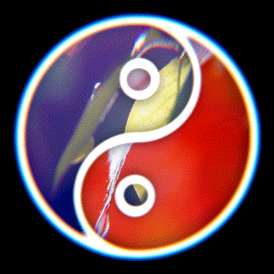
With that being said, what I’ve learned the hard way, minimal is not always simple. I, by nature, am naturally a minimalist when it comes to most things. I don’t like to spend my money when I don’t have to and that is reflected in most of the code I write. However, sometimes more elements, more code is needed to make it simpler. It seems like a contradiction, but it really can happen like it did in my yin-yang images project. Here’s the static version, which is somewhat clever in order to only use two elements, and here is the animated version, which uses more elements but, I argue, is more simple.
As I said before, don’t be afraid to change! Starting all over almost always will enable you to create something better, simpler, and more capable. In the yin-yang project I went through four iterations of how to create it before coming to the final, simple solution.
Also, development tools are your friend. At the start of my web career I had no idea how to use them properly, but now that I do my speed of programming has increased greatly. Playing around with values as you see them can help aid understanding and make getting exact values easier. After you’re happy with a section you can copy it anyway, so it’s awesome! This is what makes sites like CodePen and CSSDeck so valuable.
By far the biggest piece of advice I can give here is to not stop. Breaks are great, some of my greatest thoughts about programming have been when I’m eating, taking a shower, or doing something like running, but stopping a project is not. However, if you completely stop working on a project then most of the time you won’t pick it up again which means it won’t get finished. If you need help then there are communities like StackOverflow which can help, but I encourage you to spend a couple of days working at it and thinking before asking. Figuring things out and doing them yourself always help you become a better programmer and thinker in general.
Step 4: Everybody profits
And everybody loves to profit.
Every project, whether it’s building a table, reading a book, or making the next language to be used widely on the web, gives you experience. You become better at the skill and using the tools available. You add another thing to your resume, or it at least prepares you how to better do so. More than any of that, you make something new, something that you have made yourself which is awesome, even if it isn’t to others. As humans we find our lives much more valuable when we create.
Plus, since everything is a remix, someone can take what you’ve made and mix it with their own ideas and experience to create something even better! This process continues and we all benefit as a result. So share away! Make it open source! The more all of us do that the faster we will all get better.
Walkthrough
Now I’m going to walk through my most recent project, the yin-yang image animation step by step to show the creative process in practice.
When I first saw the gif that the project was based on, I was amazed. It was visually captivating, I loved looking at it. That’s a good sign when it comes to rating an animation good or not.
As with most anything, I thought about if I could make it with pure CSS or not. I made a similar project before, but that didn’t involve curved lines like this or the small circles. But the main concept of the two are the same.
So, having completed Step 1 above and thought about some of Step 2, I started Step 3, coding it. I started by first making the static yin-yang version, just getting the images to look like a yin-yang shape. Originally I had it split up by having
<div class="yin">
  <!-- All of image one here -->
  <div class="yang"></div>
  <!-- All of image two here -->
</div>
but this approach led to some z-index issues that I couldn’t deal with properly. Each tear composes ¾ths of the total circle vertically in order to get the background to fill up only the visible parts so that part of the image at the bottom is not hidden. Adding overflow:hidden caused some issues.
Thus, I switched my approach to the following
<div class="yin">
  <!-- Top image and small circles  -->
  <div class="yang"></div>
  <!-- Bottom image and big circles -->
</div>
which made things a lot easier. I could use pseudo elements to compose both the large and the small circles.
Then came the most difficult part – getting the background images to move opposite of their “parent”. At first I thought I’d have to use a circular motion using CSS technique like this one or the one I made due to the 75% heights, but I quickly realized I could use the same one as in the rotation experiment project that I linked above.
The essence of the technique is to take all the elements that have a background that you want to rotate, add a pseudo element to that element, and apply the background and associated styles to the pseudo element instead. This will let us rotate the pseudo element while only showing part of it due to overflow:hidden on the parent. However, since I was already using pseudo elements for my background, I realized I’d have to make them into actual elements.
I was wrong again in my thinking when I tried to size the pseudo element as only as big as its parent and actually moving the background position of the pseudo element. After failing using this approach for a few minutes I reminded myself to keep it simple, stupid and yet again restarted.
This led me to a new, simple (but not minimal) HTML structure:
<div class="container circle">
  <div class="main one"></div>
  <!-- The top half -->
  <div class="main two"></div>
  <!-- The bottom half -->

  <div class="big circle one"></div>
  <!-- The right big circle -->
  <div class="big circle two"></div>
  <!-- The left big circle -->

  <div class="small circle one"></div>
  <!-- The right small circle -->
  <div class="small circle two"></div>
  <!-- The left small circle -->
</div>
It’s not quite as clever as the last approaches, but it sure is a lot easier to work with. We can absolutely position everything and have no worries of the children affecting each other’s layout. And, as a result of the failure talked about in the last paragraph, I made the pseudo elements of each take up the full dimensions of the containing circle, which is the key to making this super simple.
Once all of that is done, it becomes very easy to animate. Using one keyframe we can rotate the containing circle and, by having an animation that is half of the containing circle and using animation-direction:reverse, counter rotate the pseudo elements (backgrounds).
Simple! The only thing I didn’t talk about was the positioning and dimensions of each element, but those should be fairly simple if one understand the approach and setup that I have.
And there you have it, the creative process at work in my most recent creation. As always if you have questions or comments I’d love to hear them. Thanks for reading!