Most any time we go to a new place, we are looking to find activities to do. It could be anything from hiking to finding a trendy coffee shop. When I first came to study at the University of Georgia, I found myself in this situation, particularly in respect to finding activities for groups of people to do and activities to do on dates. Over time I came to know a lot of local places and activities, but it took a lot of talking to people and didn’t always come when I wanted it to. It would have been great to have a way to find out about all of those activities quicker and more easily.
My sophomore year, I created a quick little prototype of an app to do just this. I called it Palm Date. It started as a project just so I could practice UI animations but turned into something I could actually use on dates to help us choose activities to do. A gif of how it worked is below.
(Open images in a new tab to see larger versions)
As you can hopefully see, it was made to be fun and help solve the issue of choice paralysis. The primary method of finding and selecting activities was a series of filters, drilling down to a specific result. While there were many things that I liked about the app, especially the unique touches of the text banner at the top and the changing color backgrounds, and it fulfilled the purposes of a one or two time usage on dates, it didn’t meet the potential I knew the idea had. Finding activities took too long and the verbiage of each choice had too much weight.
Therefore, when I was given the choice in a user experience graphic design class that I was enrolled in to work on an app of my choice, I turned back to this idea to see if I could help it reach its full potential.
It started, as most all my major designs do, on paper sketching out different methods of choosing activities. Though I sketched a lot of different formats, my mind was stuck in a rut of these filters, a page per filter.

I also created some user stories and business goals.
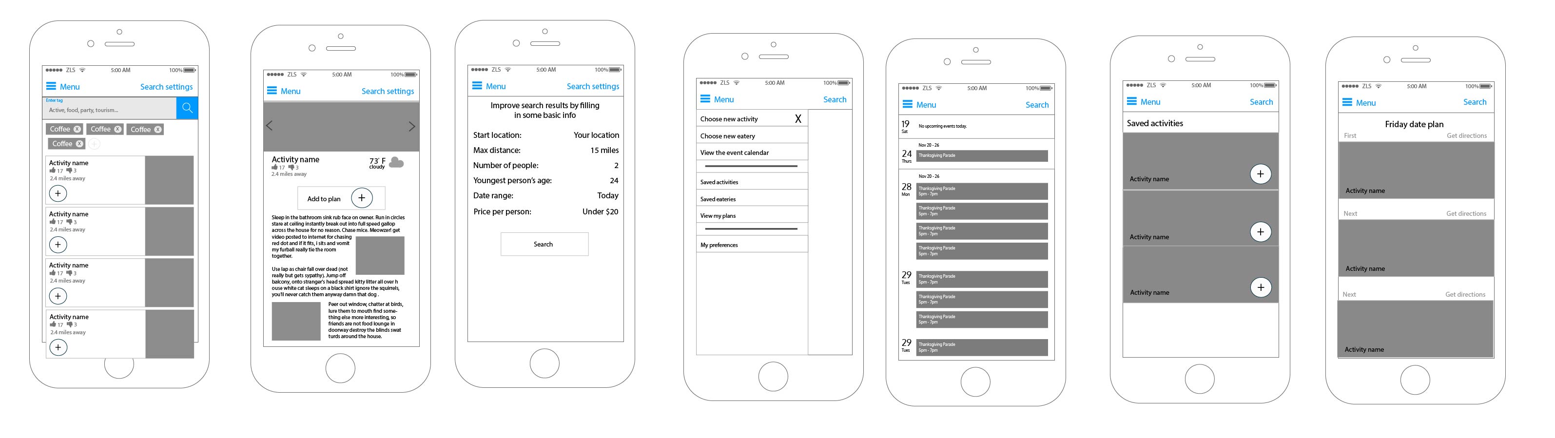
I furthered the work in Illustrator and threw together some wireframes:

I did nail down most of the features I wanted to include and gave good thought to how to keep it simple, but ultimately I knew it was still too much work for users. I just didn’t know how to fix it.
So I moved onto the UI. After looking around a bit, I created or found the following inspiration:
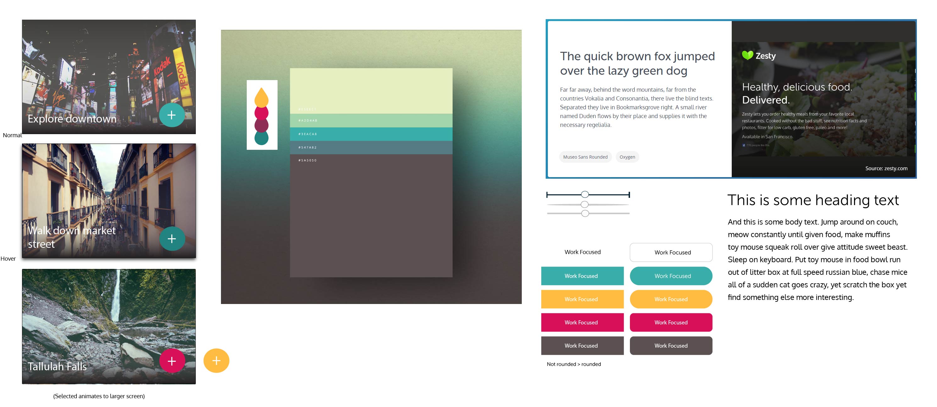
I wanted it to be modern but still fun. I settled on the colors seen above, using teal as my primary. That lead me to creating the following designs and coming up with a name.
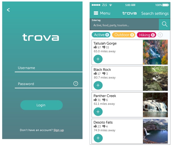
For naming, I defaulted to looking up relevant words in Italian because everyone knows that Italian sounds so cool. After searching “find” and getting “trova” as a result, and double checking that it would work with an Italian friend of mine, I had a name.
However, once I got the sign in pages and a couple other screens done, I realized that my design came off as too modern, siding on the Uber-y side of things. So I looked up some mode hand-written, painted fonts and was deciding between the following two:
I decided that the one on the right, “DK More Or Less”, was less edgy and more general purpose, making it more appropriate for my app. I looked back at my colors and played around with some of them to make the background gradient. Now I had that fun element that I was looking for.
During this UI design process, I thought of how to fix my multi-step filter problem. Of course I was overthinking the situation – the better solution was just to use tags so all the filtering can be done on the same page! By processing each tag as it is inputted (after completion), we can retain the same filtered effect I was looking for but remove all screens but 1.
What remained was to implement the style from the login screen onto each of the wireframes and clean up parts as I went. What follows is my finished product for now:

Overall I gained a lot of skills in Illustrator, learned a bit more about design thinking, gained experience thinking through problems and use cases of an application, and got to have some fun designing. I am not sure if I want to pursue this as a more full time project (I think it has a lot of potential). If you’re interested in pursuing the idea, please reach out to me!